Author Archives: jasonhintlian

Android Fragments Part 1 XML

I was originally thinking I would talk about inheritance in this blog entry but I decided to step it up a notch and talk about something more interesting. I will be breaking the content up between two or three blogs as it will be fairly in depth.

Any one who has been programming in Android recently, probably knows fragments are a necessity if you want to have cool looking UI’s on multiple devices but If your new to Android and have not used fragments or simply don’t get them, this blog/tutorial might help you.  Fragments were introduced back in February of 2011 with the release of Android 3.0 so this is not a brand new topic but its a crucial one and so here it goes.

Fragments allow you the developer to have separate sub activities within your current activity and essentially host multiple independent UI’s on the same screen.  They are great for displaying multiple activities at once on larger tablets and you can even replace existing fragments with other fragments on the fly.  That means you no longer need to have an activity for every page.  Sort of any way.  A single activity lets say running on a phone for instance, so it is only displaying one fragment at a time, can switch fragments in and out as it needs them; but realize that “fragment” is just a clever name for a sub activity so every fragment still must be hosted by an activity.  If your developing in Android you will want to get comfortable with fragments so you can have a professional looking app, regardless of what device its being run on.

There are two ways android allows you to use fragment in your XML file.  You can hard code a fragments into a your page layout or you can create FrameLayout and then add fragments late using code.  The second option, using a FrameLayout, allows you to not only add but also replace fragments on the fly using code.  Taking this approach will provide you much more flexibility and so its the approach I will be showing using code from my most recent project.

Here is the rafter_output.xml file from my Rafter Maker project.

<?xml version="1.0" encoding="utf-8"?>
<LinearLayout xmlns:android="http://schemas.android.com/apk/res/android"
 android:layout_width="match_parent"
 android:layout_height="match_parent"
 android:baselineAligned="false"
 android:orientation="horizontal" >

 <FrameLayout
 android:id="@+id/fragmenta"
 android:layout_width="match_parent"
 android:layout_height="match_parent"
 android:layout_weight="7" />

 <FrameLayout
 android:id="@+id/fragmentb"
 android:layout_width="match_parent"
 android:layout_height="match_parent"
 android:layout_weight="3" />

</LinearLayout>

Notice at line 6 the orientation is set to horizontal and then on lines 12 and 18 I have applied a weight to each FrameLayout. This will divide the screen real-estate amongst each fragment accordingly when we load them in later.  Something worth mentioning here is how weights are calculated, only because in my opinion the process is a bit counter intuitive.  One would think that if fragmentA has a weight of 2 and fragmentB has a weight of 1 that we add them together to get 3 and then divide the weight of either fragment by that 3 to get the percentage it occupies on screen  Meaning fragmentA would get 66% and fragmentB gets 33% but that is not the case, its actually the reverse.  FragmentB will only occupy 66% while fragmentA will occupies the other 33%.  Why it works that way I could not say.

Now next I will show the xml page layouts that we will be displaying in the fragments, which will eventually get loaded into our FrameLayouts.  Below is a simplified version of my fragment_rafter_output.xml file.  They original has many more rows of data which is why I choses to use a TableLayout as the root of the xml page.

<?xml version="1.0" encoding="utf-8"?>
<TableLayout xmlns:android="http://schemas.android.com/apk/res/android"
 android:id="@+id/tableLayout1"
 android:layout_width="match_parent"
 android:layout_height="match_parent"
 android:layout_alignParentTop="true"
 android:layout_marginLeft="10dp"
 android:background="@color/theme_secondary_color" >

 <TableRow
 android:id="@+id/tableRow1"
 android:layout_width="wrap_content"
 android:layout_height="wrap_content" >

 <TextView
 android:layout_width="wrap_content"
 android:layout_height="wrap_content"
 android:text="Angle A = "
 android:textAppearance="?android:attr/textAppearanceLarge"
 android:textSize="20sp" />

 <TextView
 android:id="@+id/tva"
 android:layout_width="wrap_content"
 android:layout_height="wrap_content"
 android:text="0"
 android:textAppearance="?android:attr/textAppearanceLarge"
 android:textColor="@color/text_color"
 android:textSize="20sp" />
 </TableRow>
</TableLayout>

Now here we have my fragment_image_output.xml. file.  I’ll show the whole file because most of it will become relevant as we move on.

<?xml version="1.0" encoding="utf-8"?>
<RelativeLayout xmlns:android="http://schemas.android.com/apk/res/android"
 android:layout_width="match_parent"
 android:layout_height="match_parent"
 android:id="@+id/RootView">

 <View
 android:layout_width="10dp"
 android:layout_height="fill_parent"
 android:background="@drawable/shadow_left" />

 <LinearLayout
 android:id="@+id/llbuttons"
 android:layout_width="match_parent"
 android:layout_height="wrap_content"
 android:layout_alignParentBottom="true"
 android:layout_marginLeft="10dp"
 android:layout_marginRight="5dp"
 android:layout_marginBottom="5dp"
 android:orientation="horizontal" >

 <Button
 android:id="@+id/bback"
 style="@style/ButtonText"
 android:layout_weight="2.5"
 android:background="@drawable/btn_blue"
 android:text="&lt;" />
 <Button
 android:id="@+id/bcreate"
 style="@style/ButtonText"
 android:layout_weight="1"
 android:background="@drawable/btn_blue"
 android:text="create" />

 <Button
 android:id="@+id/bnext"
 style="@style/ButtonText"
 android:layout_weight="2.5"
 android:background="@drawable/btn_blue"
 android:text="&gt;" />
 </LinearLayout>

 <TextView
 android:id="@+id/tvStep"
 android:layout_width="wrap_content"
 android:layout_height="wrap_content"
 android:layout_alignParentTop="true"
 android:layout_centerHorizontal="true"
 android:text="data"
 android:textSize="20sp"
 android:textStyle="bold" />

 <FrameLayout
 android:id="@+id/flimage"
 android:layout_width="match_parent"
 android:layout_height="match_parent"
 android:layout_below="@id/tvStep"
 android:layout_above="@id/llbuttons">

 <ImageView
 android:id="@+id/ivInstImage"
 android:layout_width="match_parent"
 android:layout_height="match_parent" />
 </FrameLayout>

</RelativeLayout>

The first thing I want to point out is a small added bonus. If you look at lines 7-10 you will notice a View which sets a background gradient called shadow which is 10 dp wide and is the height of the page. This will make the page to its left appear closer to the user and add an element of depth to your app. The other thing to notice is the three buttons. We will be using those later to update our fragments. The last thing to notice is the FrameLayout containing our ImageView. When we click the next or back button a new rafter image will be loaded and the data fragment will be updated accordingly as well.

Well, that takes care of the XML layouts we will need, the next part to handle will be the the code that defines our fragments and our host activity in Java.

Till then,

Jason Hintlian

From the blog jasonhintlian » cs-wsu by jasonhintlian and used with permission of the author. All other rights reserved by the author.

Java Interfaces

This week I have decided to take the blog in a different direction.  Instead of blogging about the weeks’ progress and what’s to come, I am going to start focusing much more on being informative and helpful to readers who may have had similar troubles.  Today, I am going to be talking about interfaces in Java, and how I used them in developing my Rafter Maker app for Android.  Now, why would I want to use an interface?  Well, an interface will allow you to pass objects in your code generically.  For instance, I can create any number of objects which implement the Rafter interface and then pass them all throughout the code defined generically as Rafter.  This makes it possible to retrieve the same data from any type of rafter through a generic variable, while allowing the code in each rafter object to  be unique.  I created some examples to illustrate my point.


public interface Rafter{

getAngle();
getLength();
getName();

}

Above, is a simplified example of the Rafter interface in my app.  The original has more methods, but that’s the only difference.  


public class ShedRafter implements Rafter{

private double angle, length;

public ShedRafter(double rise, double run){
// calculate angle and length from rise and run
}

@Override
getAngle(){
return angle
}
@Override
getLength(){
return length
}
@Override
getName(){
return "Shed Rafter";
}

Above is a simplified example of a shed rafter class from my app. Notice it implements the Rafter interface and overrides each empty method declaration in the interface. Any class that implements an interface must override all the methods within that interface otherwise you will get an error that says something like “must implement the inherited abstract methods” meaning the abstract (undefined) methods in the interface.


public class GableRafter implements Rafter{

private double angle, length;

public GableRafter(string pitch, double span){

// calculate angle and length from pitch and span
<pre>
@Override
getAngle(){
return angle
}
@Override
getLength(){
return length
}
@Override
getName(){
return "Gable Rafter";
}
}

Above here is a simplified example of a gable rafter class from my app which differs from the shed rafter class, but notice that both classes implement the Rafter interface allowing the creation of a Rafter object that can be a ShedRafter or a GableRafter .


double span = 144, rise = 60, run = 144;
String pitch = "5/12"

Rafter rafter = new ShedRafter(rise, run);
rafter = new GableRafter(span, pitch)

The classes take different  arguments with different names and the algorithms for calculating a rafter from a rise and run versus a pitch and span are also different; though I don’t show them for the purpose of simplicity.  This approach allowed me to perform completely different calculations in each rafter object and on different variables, while still adhering to the interface definition by overriding getAngle(), getLength() and getName().  This way both classes were Rafters and Rafters are  generic.   While in contrast each individual rafter class implementing Rafter’s  is  unique.

This made it easy to create any rafter on the fly and pass it to my output class, which is responsible for displaying the angle length and name of  the rafter.  Now there is no need to check or know what type of rafter you have, because it does not matter, all the differences between rafters have been compartmentalized within the individual definitions.  For instance, the getName() method is easily modified to return the proper names for each rafter, and likewise I can easily change the way I calculate angle and length in the constructor.  The behavior of methods I might add to the interface later on will also be easily modified and will require minimal updating to the code overall.


double span = 144, rise = 60, run = 144;
String pitch = "5/12"

Rafter rafter = new ShedRafter(rise, run);

System.out.println("Print " + rafter.getName() + " Data\n");
System.out.println("The angle is = " + rafter.getAngle());
System.out.println("The length is = " + rafter.getLength() + "\n");

rafter = new GableRafter(span, pitch)

System.out.println("Print " + rafter.getName() + " Data\n");
System.out.println("The angle is = " + rafter.getAngle());
System.out.println("The length is = " + rafter.getLength() + "\n");

Above you can see it is easy now to define a single Rafter variable and use it to get the values from any rafter class which implements the Rafter interface.

Well, thats it for this blog.

Till next time.

From the blog jasonhintlian » cs-wsu by jasonhintlian and used with permission of the author. All other rights reserved by the author.
Drawings, Diagrams, and Instruction

I spent this week tidying up a few odds and ends in my rafter creation app as well as drawing diagrams and creating icons.  I have done a bit of coding, as well as correcting a bug I discovered with gambrel and mansard fascia calculations.  There will be more coding needed before I can publish still, but not too much, the rafter instructions are not yet housed independently in their respective classes.  That – and I still need to build in an options menu with an ‘about’ page and an option to quit the application.  I have honestly been debating whether it is entirely necessary, but have been leaning towards yes.  The reason being, I don’t want the user to become frustrated with clicking the back button repeatedly when they want to quit.  There is also an issue with the fascia options regarding what to do when the user selection will not allow for a standard fascia cut.  In the event of steep pitches and short fascia projections, it can become necessary to notch the birds mouth cut of the rafter above the top plate.  When this happens you need to lace the plywood or sheathing with the portion of the rafter that is notched out.  I show this situation in the picture below.  

Image

The problem is the user may already have sheathed their building, in which case their needs to be some sort of warning to let the user know the affect of their choice.  There are a few ways I could handle this.  I could limit the user from making choices that create this situation.  The draw back here is it is not a bad practice to notch above the plate in order to accommodate the proper fascia size, and there is no reason not to apply it other than that it will require more work.  I could also choose to allow the situation to occur and just give the user a warning.  However, that would not be very helpful to the user and it would require disabling the creation instructions because they would be incorrect in such a situation.  The last and I think best scenario is to catch the situation and warn the user, giving them the option to re-enter new data or proceed.  In the event that they proceed the fascia activity will pass a message along to the output activity.  This message will let the output activity know what changes to make to the images and instruction in order to accommodate the new fascia cuts.  As a bonus to this approach, the app would be able to accommodate any fascia size in any circumstance.  The draw back would be that it will take the most time to implement and I am severely short on time.


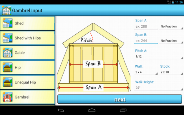
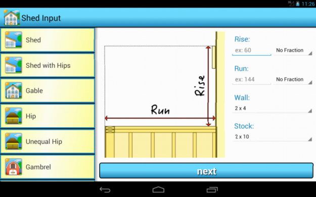
I have completed some of my diagrams and icons this week so here are some pictures of the final product.  

Image

Image

My plan is to utilize top down views to show the necessary inputs for hips, unequal hips, mansards and sheds with hips, as my original 2D approach left to much to be assumed on the user end.  For instance you cannot show to different opposing pitches with a 2D diagram.  I will be working on those soon and will post some more pics when they are ready.  In addition to that I still need to draw all the instructional diagrams, which depict how cut up each rafter.  The textual instructions for cutting common rafters are complete but I still need to write instructions for cutting other more complex rafters.  I expect to finish all diagrams and textual instruction by the end of the week.  I will be working in order of what is most important.  Any instructional texts that don’t get done by the end of week will have to be part of the second version at this point.  That’s pretty much all thats left before I can publish so I had better get back to it.


Till next time.


Jason Hintlian

From the blog jasonhintlian » cs-wsu by jasonhintlian and used with permission of the author. All other rights reserved by the author.
Gambrels, Mansards and Theming

Well, It would seem another two weeks has flown by but with midterms this past week; I hardly noticed.  I honestly would have had nothing to post a week ago due to a test in Operating Systems which required a lot of preparation.  I also had to set up two other operating systems on my Mac Book Pro Retina MBPR for that class as well this past week and write a report on it.  That said I am going to try and post a tutorial for setting up Ubuntu and Windows 8.1 on a  MBPR using the Refind boot loader, I downloaded from GitHub.  Reason being it is not very straight forward and I could not find any clear instructions myself for setting up a triple boot system on a MBPR.

Anyway, once I finished all that I was in the clear to get some work done on my rafter app.  I decided I would tackle Gambrels and Mansards simultaneously due to there similarity in nature.  Simply put, a Mansard is a Gambrel with hips.  Considering all the mathematical logic I needed was already completed doing past roofs, it only took two days to implement everything else involved.  Although, I have to admit one of those days was severely inhibited due to a Saint Patricks Day work party my wife and I had to go to the night before.  In any event, all the roofs I will be offering in the first version are complete now and by that I mean the great majority of the code is completed.  I have neglected art work, diagrams and the instructions sets which is basically the content of the app, in an attempt to catch up on my tentative deadlines.  Unfortunately, I am not much of an artist and it tends to take me a long time to create icons and diagrams.  The plan now – regardless – is to complete all of that which I imagine will take a couple weeks at least.

This is not what I had hoped for, but the fact is it leaves four maybe five weeks to convert the app to iOS.  However, I am convinced that with layouts, instructions, icons, and themes finished in Android, the conversion will go smoothly.  There was really nothing I could cut from the first version, other than dormers, in order to expedite the process.  Dormers would have been a slightly different animal and they should have needed there own menu as well, so it made sense to cut them.  As a consolation for the loss of dormers from my original proposal though, the app now includes sheds roofs with hips, unequal hip roofs and mansard roofs.  I felt this was a rational and fair trade-off. 

In addition to the two new roof options I added this week, I also made some major updates regarding theming.  Android makes it very easy to customize the look and feel of your app.  You can create customized backgrounds for anything that supports a background; which is almost every UI component available.  In addition to that Android provides a style.xml file in your res/value folder where you can set themes for the entire app like text styles, menu styles, action bar style etc..  It took a little while to wrap my head around it at first, but now changing the theme of the app has become quite trivial.  I spent a good amount of time this week just playing with all the different options and trying to decide which themes best suited my app.  I will be working to finish my icons this week and diagrams so I can post some pictures of the app.  The instructions will more than likely be written before the instructional diagrams, but I will be able to post pics of the menu and input screens soon.

Till next time.

Jason Hintlian

From the blog jasonhintlian » cs-wsu by jasonhintlian and used with permission of the author. All other rights reserved by the author.
Android ImageView’s and Out of Memory Errors

It has been a rather unfruitful couple of weeks.  I have been battling with Android’s infamous out of memory errors for most of the past two weeks.  It has been seemingly impossible to find a solution for my app which satisfies all of its necessary requirements.  I would like to have an independent class for handling the execution of images on a background thread.  I also want that class to create Bitmaps, which fit the ImageView so as to not waste heap space.  Then I want to cache those images, to increase load times while avoiding the creation of duplicate bitmaps, again saving heap space.  So what are the problems?

Well for starters, I need some way of grabbing the width and height of the ImageView; which is more difficult than you would expect.  You cannot simply create an ImageView in the activities onCreate method and call its getWidth and getHeight methods because the screen has not been laid out yet. One way you can get around this is to use the ViewTreeObserver class to set up an OnPreDrawListener or a GlobalLayoutListener, then grab the image width and height from within them.  For example, you can override the onPreDraw method within the OnPreDrawListener and fire any code you want from within there. The Android developers page says onPreDraw is the “Callback method to be invoked when the view tree is about to be drawn”.  The method is constantly being called; perhaps every time the screen refreshes.  That means to use it I needed some kind of catch so my code only fires when a new bitmap is loaded. It was simple enough to handle with a boolean value, but it seemed wasteful to be in a constant cycle when I only need the value once.   Another attempt I made was to override the onWindowFocusChanged method in the Activity classes, which holds my fragments and then call a custom method within the fragments to populate the imageView with the properly sized bitmap.  At first I thought it worked, but the method is only called when the activity sets up, not when each fragment is loaded.  That, and it was not a very modular approach requiring a method override in every activity where I wanted to use images.

In the end, I settled on a different solution.  I had seen a blog, before this out of memory issue ever began; and I was able to implement the solution.  I searched for the blog again but I could not find it, I think because it was a link within one of the hundreds of Stack Overflow posts I have been reading lately.  That said, if I come across the blog again I will post the link.

Anyway, the idea was to add a CustomView class to a FrameLayout and within the CustomView class override the onSizeChanged method.  Then within that method, you can set the newX and newY parameter values as your width and height for the bitmap you want to create.  Originally, I did not want to use this approach because wrapping my imageView in a FrameLayout seemed unnecessary.  OnSizeChanged is not called if you don’t add the CustomView to the FrameLayout.  It also turns out that Layouts in general provide some basic animations for developers.  That was a bonus, unfortunately the animations I made felt a bit clunky and created unnecessary animation delays.  I decided to avoid animation for now, at least until I understand a bit more about it.  Also, I don’t want to waste any of my semester on unnecessary improvements until the basic functions are complete.  In any event, I had overcome the first unexpected hurdle of the week and am now able to generate properly sized bitmaps.  I used the suggested code from the Android Developers page for decoding large bitmaps.

Unfortunately, loading properly sized bitmaps did not fix the out of memory issue, but it was happening less frequently.  I decided I would continue following the advice on the Android developers sight regarding Displaying Bitmaps Efficiently  at https://developer.android.com/training/displaying-bitmaps/index.html as best I could.  Personally, I find there to be a huge lack of details on the Android developers page, which can make implementing their code difficult at times.

I eventually was able to use the AsyncTask class to handle my images on an independent thread, build a cache for the images, and create custom sized bitmaps all in one class that extends View in order to grab the ImageView dimensions.  Along with some clean up in the onDestroy methods of my fragments; I managed to greatly reduce the memory leak to the point where a user would need to button mash through the pictures for a long time before it would crash.  However, this was obviously still unacceptable.

The leak left was much to small to crash the app when used normally, but I knew it was there and it irritated me to no end.  I eventually realized I was creating a new custom view each time I was loading an image, instead of overwriting the same view.  I also discovered that some of what I thought was a memory leak is not,  in the case of loading multiple images in and out of the same ImageView the heap space will appear to be growing by a few kilobytes each time the image changes.  However, that memory is eventually reclaimed, perhaps it is simply the heap space becoming fragmented which is eventually cleaned up, but I am really not sure.  To be sure there was no longer a leak though, I set up an onPreDrawListener which changed the image every time it was called, many times each second.  Then I left the app to run for a couple of hours loading images on my Samsung Galaxy S3 and it no longer crashed due to an out of memory error.  Success!

In the end, I actually decided to remove the cache logic.  My reasons are the cache requires more heap space for storing multiple images, and when a fragment loses focus the entire cache is stored on the heap so the user can go back.  You can recycle the bitmaps in the onPause method, but then they need to be loaded into the cache again.  It sort of defeats the purpose of having the cache.  Furthermore, users will not typically be cycling through images when using the app and it did not make sense because you can only cache only 3 or 4 large bitmaps before one must be evicted.  When I tested the app on actual devices, the image load times seemed instantaneous too.  I only needed to be sure that if the user cycled through all the images repeatedly the app would not crash and the gain in speed for memory the cache offers does not seem worth it.

On top of all that, I made some UI changes to my app this week and I think they will make using the app much clearer.  I broke what was three roofs into five, allowing me to remove valley and hip sets from the instruction section and allow them to be standard when needed.  Along with that, templates have their own create button now. I also provided buttons for cycling through multiple roof rafters.  Now the instructions tab can house nothing but actual instruction texts and the app as a whole seems more intuitive. I was hoping to add more roofs and content these past two weeks, but it just did not work out.  This week I will tackle gambrel and mansard roofs.  Next, it will be onto adding textual content, drawing diagrams, publishing the Android version; and beginning on the iOS version.  As time becomes to much of a constraint I may add the mansard roof in the next version of the app.

Till next time.

Jason Hintlian

From the blog jasonhintlian » cs-wsu by jasonhintlian and used with permission of the author. All other rights reserved by the author.
Hip Rafters and more Refactoring

Well, its been a bit over a week since my last blog because I have not been able to pull myself away from coding.  The goal for the week originally was to get hip roofs done, but falling behind a bit last week made me shoot fro getting hips and gables done in the same week.  This did not turn out to be possible as there were a number of obstacles which presented themselves as the week went on.  I can say at this point that basic the hip roof is fully functional but so far there is no option for valley rafters and valley jacks.  As it turned out, the hip roof consisted of more than was originally considered, ballooning from 3 different rafters to as many as 8 if there is a valley.

So why did hip roofs turn out to be so so complex?  Well to start with, I only considered the 3 most basic rafters needed when building a hip roof, the common, hip and hip jack rafters.  However, once I emerged myself in the task I realized how short my intentions fell.  I’ll start with the first issue encountered strictly regarding the design of my hip implementation; and I will discuss issues encountered in the code design next.  The first set back when designing a hip roof was that many code books require a ‘double hip’, meaning there are two hip rafters which connect the ridge pole to a corner of the building.  The two rafters, while sharing many values in common, differ in compound angles and the process for cutting.  The second issue I encountered was putting a hip on a square frame.  In the beginning, I had intended on making a hip roof object that only had one roof pitch, but in the event of a square frame the hip rafters would meet in the very center of the building leaving no room for a ridge pole.  The way to circumvent this problem was to now offer unequal pitches.  Now users can select 2 pitches  for example: pitch A could be 5/12 and B 7/12.  I wont get into the finer details here but suffice it to say it was a lot more work behind the scenes handling unequal pitches.  It also created the need for two individual rafter jacks and valley jacks.  Just to put this in perspective, a shed roof or gable consist of one common rafter but a hip can have a common, inner hip, outer hip, inner valley, outer valley, hip jack A, hip jack B, valley jack A, valley jack B which was a bit more to keep track of.  I never even got to think about Gambrel roofs this week but they will be next.  Now I will explain the refactoring I did this week and why.

For refactoring this week there where two goals in mind, code to an interface not an implementation and cleanliness of code or easiness to read.  Thus far, I had been putting all my data into what android calls a bundle or passed it directly via an android Activities Intent.  The bundle and data were passed along to all Activities and Fragments which are essentially sub activities and used or updated as needed.  However, it was very messy and hard to follow.  Furthermore it caused a situation were rafters were being created in all different areas as soon as the necessary data was collected instead of in one place every time.  I felt like this decreased the modularity of the code and readability.  My solution was to trace all the code from the very beginning and make sure I always used a bundle to pass data and that only one was actually created and simply passed between activities.  Fragments would no longer be responsible for updating the bundle, they just pass the data back to the activity which places it into the bundle and sends the bundle along.  So this solved my issue of passing data in a clear and concise manner but I still had an issue with the design of my rafter classes, up until this week – there was only one…

To start tackling the problem I did something that can be difficult, nothing.  What I mean is I coded nothing, after all there is a time to think and a time to act.  I needed to find a way to package everything I needed under one roof, pun intended (haha), and have it be modular and versatile.  I could not help but think back to a strategy class I took and so I started reading up on strategy patterns.  What I landed on, I don’t believe is technically a pattern; though I could be wrong, but rather a fundamental principle to code by.  Program to an interface not an implementation, meaning write your code to fill out an already designed interface that outlines what you want, do not just code classes separately to do what you want and worry about modularity later.  Up until now as I said I only had one rafter class, which executed different logic based on whether I asked for a shed rafter or a common rafter.  I also had a separate fascia/soffit class; ugly but it worked for the time.   After a few days of careful planning, I decided that I would Start from a Roof interface which all roof classes would implement.  The sole purpose of the roof class is to create the needed rafters and add them to a rafter array.  That leads me to another good point going back to strategies which is, its better when a class has an object as opposed to trying to be that object.  Meaning the roof should not try and handle rafter logic, but simply create rafters which contain all there own logic.  All roofs implements the roof interface so I can pass then generically throughout the code and have one purpose delivering an array of rafters.  The rafters themselves were handled the same way, but first I had to condense the fascia/soffit logic in with the rafter logic as it really belonged together.  Then I created a rafter interface again allowing my objects to be passed generically, and making it easy to change a rafters concrete class at run time.  Now rafters and roofs are completely self contained and modular, making it simple to create a roof which then provides the output and instruction activities with a rafter array. Thus allowing those activity classes to easily access data generically – not needing to know what type of rafter it has.

I wish I could say that was all I had to deal with this week but it wasn’t. I also ran into an ‘out of memory’ error when testing on older phones. This was actually an old error come back to haunt me which cost about a day and a half spent creating a custom view class.  The only way I could get height and width of a layout was to extend view which was impossible in my activity classes because they already extend Activity.  So basically the solution was to add the custom view to a FrameLayout which contains an image view, an image, the resources and the activity containing everything.  This has allowed to modularize the resizing and loading of images large.  The only issue I found was that when cycling images in and out of a Frame Layout you must remove the old image before adding the new one or performance can seriously suffer.  Now my code uses a fraction of the heap space it was and is faster and more efficient.

The last issue of the week was with the action bar and running on older devices.  Certain API’s only support certain action bar functions and API’s 10 and under require a support library for action bars.  I will stay backwards compatible at a minimum as far back as API 11, but I will probably support back to API 8 as well.  In the end what it means is I have different looking action bars for API’s less than 11, then from 11 to 13 and then customized action bars for API’s 14 and up.  At this point I am well within the fourth week of classes and starting to feel the pressure so I am sure my next blog will be full of updates just like this one.

Till next time,

Jason Hintlian.


From the blog jasonhintlian » cs-wsu by jasonhintlian and used with permission of the author. All other rights reserved by the author.

A week of Refactoring

I began this week hoping to finish the hip rafter roof system implementation for my new Rafter Maker app.  However, I ran into a bit of a snag which required some restructuring.  The issue was – up until now, every roof system I have done, shed and gables, has only required one rafter, but a hip roof has three different rafters.   At first it did not seem like much of an issue but it became apparent that with the way the apps navigation was set up; I could not simply add a next button.  The underlying reason was thus far every class and activity has been reusable, because rafters are very similar whether or not they belong different roof systems.  Thus far I was developing separate input classes for each roof type, which would cause my program to have unnecessary repetitive code.  Instead, I chose to simply build a few FragmentActivities and fragments, which take in common inputs.  They passed a RoofState by the main menu when a roof is selected which has allowed me to reduce the number of classes and code overall.

In addition to this, there was a more obvious design issue with having multiple instruction sets.  With only one rafter to handle for shed and gable roofs it was easy to just offer an instruction button once the template data was generated.  However, having the one button for instructions would not allow room for a ‘next rafter’ button; in the case of a hip or gambrel roof, which require multiple different rafters, without effecting the ascetics of the app.  For that reason, I spent a good bit of time studying the android action bar.  I set up an spinner and several buttons and menus to get a feel for what I liked and eventually settled on just using an Xml menu item with other nested menu items creating the effect of a button with a submenu.  This allowed me to display an icon as well as text in the action bar that offers other options for instruction.  Now the app will be able to offer multiple instructions sets to help users throughout the process of building their roof, as well as handle roof systems with multiple different rafters.

The progress made this week was undoubtably in the right direction, but it has left me slightly behind on my timeline for completion.  In an attempt to make up lost time I will implement hip and gambrel roof templates this week.  The following week will be spent adding a few more templates and then the week after that on drawing up the rest of the diagrams I need and instructions.  I will be hoping to launch the android beta in about four weeks.  Then I will begin working on the iOS version, which should go smoother having already worked out a good many kinks developing for Android.  I have decided I will post pics in a few weeks once I have completed the necessary diagrams to truly show off the apps functionality.

Till next time,

Jason Hintlian

From the blog jasonhintlian » cs-wsu by jasonhintlian and used with permission of the author. All other rights reserved by the author.

Rafter Maker an Android and iOS Project

This will be the first of many blogs this semester explaining the progress and discoveries I have made during the development of my app.  My task, simply put, is to develop an application for Android which can be used to create roof rafter templates and generate specific instruction sets at run time.  I then intend to convert the Android version to iOS. I will be covering the most basic of roof applications for the first version.  It will will include shed, gable, hip, and gambrel rafters as well as gable and shed dormers.  Fascia and soffit will be handled as well, but they will be integrated into each template – due to their dependence upon the roof angle or pitch. The templates will be the main function of the app, but I will work to also include detailed instruction sets regarding roof construction.  

 Once that is accomplished, I will publish the app to the Google Play Marketplace as a free beta for a minimum of thirty days.  Hopefully, my users will find any bugs that have eluded me.  I plan to test all of the template algorithms with JUnit for Android and OCUnit for iOS, so there should be no bugs within those methods.  When the app is published I will begin working to convert it app to iOS.  I have done some preliminary research on developing for multiple platforms and despite there being softwares like Phone Gap and Titanium, I have decided to code the Android and iOS apps separately in native code.  My thought is, I will not need to put as much effort into the iOS version because the app content will already be completed, and also by coding natively my app will have OS specific look and feel.  In theory, I will just have to rewrite the code in objective-C though I am sure there will be plenty of problems along the way due to the major differences between Android and iOS app structure.  

 Upon completion of the iOS app, I will publish it to the Apple App Store as a free beta for a thirty day minimum.  Once the apps come out of beta, I will make them available for a fee in both marketplaces.  I had considered embedding advertising into the apps and offering them for free, but the market for construction apps is so narrow I have decided against that.  However, if I was marketing to children – who seem to love clicking anything and everything I would most certainly have made it free and embedded advertising.  

 With so much work to do I decided to begin early before the start of the semester.  I actually will be starting with a half finished android application.  I have a completed the shed rafter template and embedded the fascia soffit calculations into its process.  I also created a separate UI for tablets so the extra screen real-estate will be properly utilized. The app will support Android version 2.2 and newer, but there may be some limitations on small screen sizes.

 I will be blogging later in the week about some of the more difficult challenges I have encountered thus far.  There will be some screen shots of the phone interface vs the tablet as well.  Once the Android app is complete and I will begin coding in iOS; I will focus some of my blogs on the the differences between developing for both platforms. 

 Till next time.

 Jason Hintlian

From the blog jasonhintlian » cs-wsu by jasonhintlian and used with permission of the author. All other rights reserved by the author.

A Final Finishing Touch

Image

Well this will be the very last post regarding the coloring app for the Worcester Art Museum.  I have only made one change since the last post and that was to add a back button.  The reason for this was because we have a navigation bar built into our app but on the coloring app page it causes squishing because the positioning is done with percentages.  The outcome is the app looks fine if the window is a enlarged but things overlap and become unusable if you make the window to small.  The solution; remove the navigation bar from the coloring app completely and add an html back button.  I tried a few different codes for this but in the end I settled on onclick = “history.back(-1)”.  This way I do not need to worry about traversing the files I just go to the previous page onclick =””.

Till the next Project.

Jason Hintlian 

From the blog jasonhintlian » cs-wsu by jasonhintlian and used with permission of the author. All other rights reserved by the author.

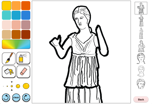
The Final Product

Image

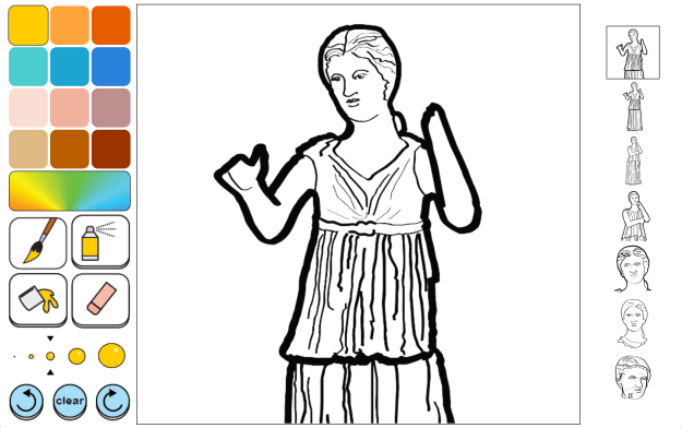
The coloring app is finally done.  I was able to get the button png’s from the Worcester Art Museum this past week and I am happy to say that the app is looking great.  I had some minor functionality issues while trying to undo on the iPad but it is mostly fixed now.  The issue was that you had to click the button twice in order to undo a click event.  The fix was a simple as checking to see what platform the user is browsing on, if its an iPad I call undo and redo twice.  Its an ugly fix but it works.  I also added shadowing to the color page pictures and colors to let the user know what is selected.

I added the tool buttons to a canvas that changes color with color selection which make the color selected obvious.  All in all I think the app came out quite well and I cannot wait for people to try it out at WAM’s new idea lab.

Till the next project.

Jason Hintlian

From the blog jasonhintlian » cs-wsu by jasonhintlian and used with permission of the author. All other rights reserved by the author.